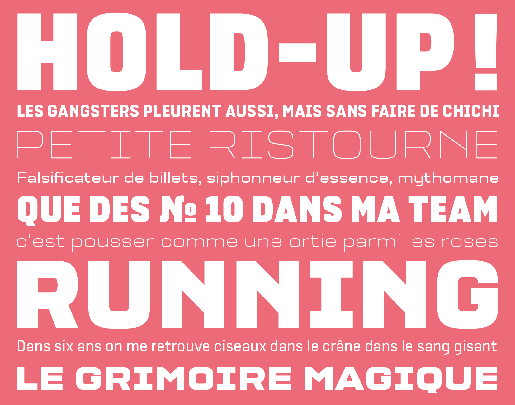
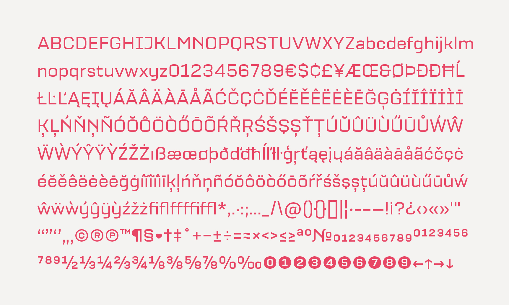
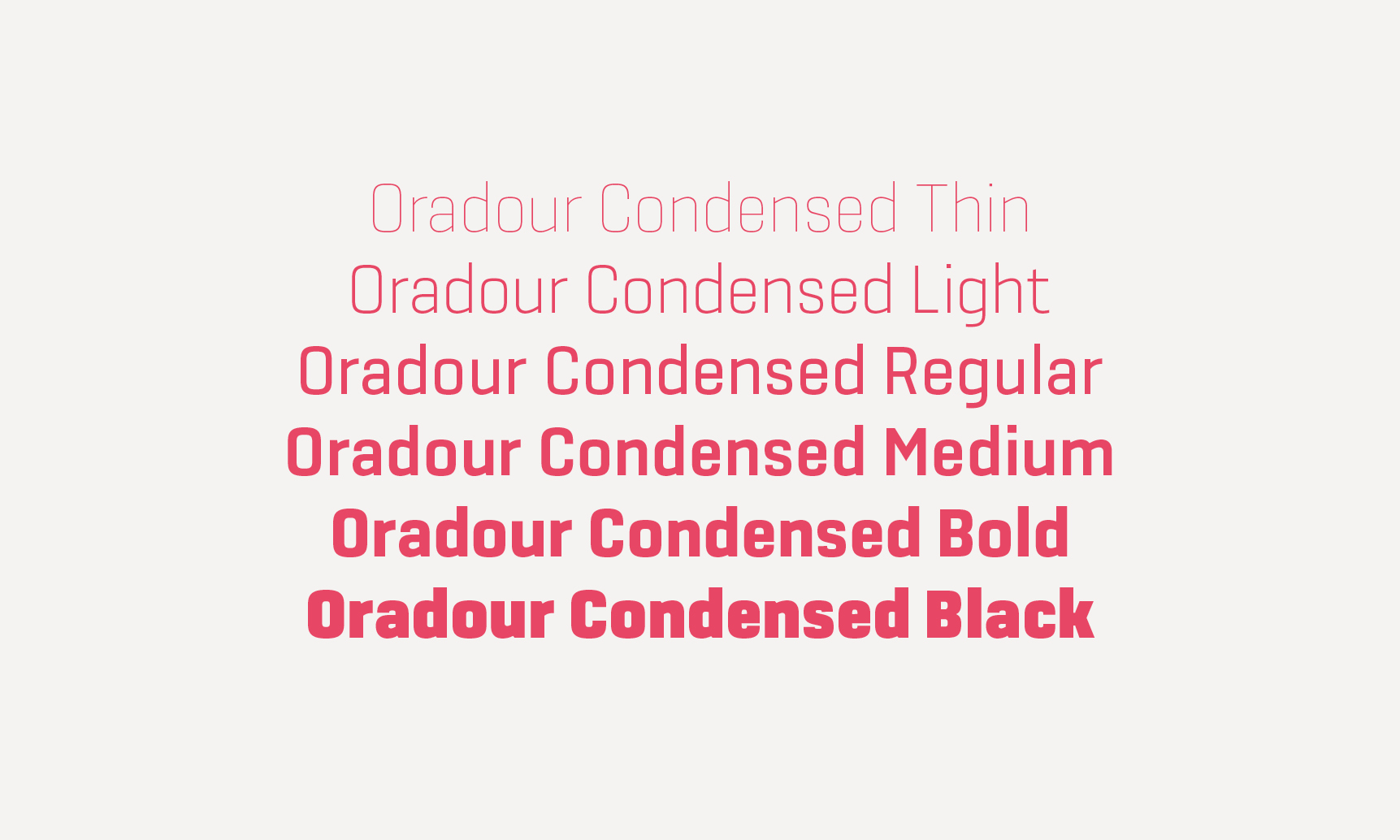
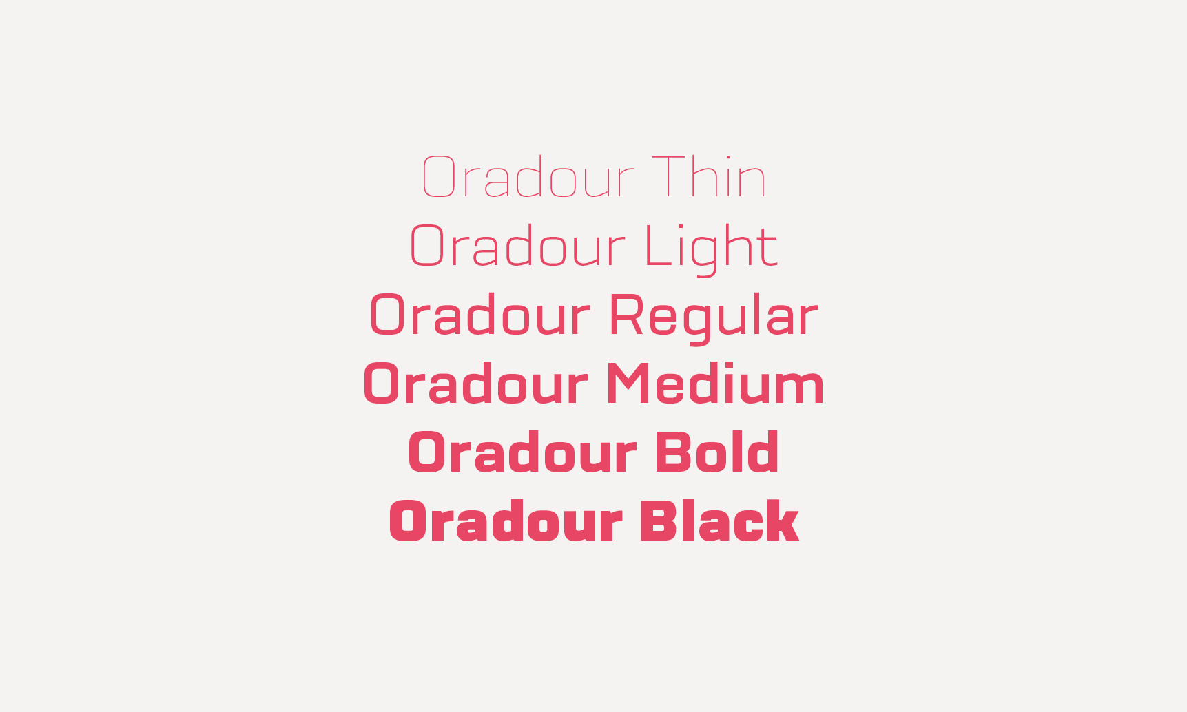
Oradour
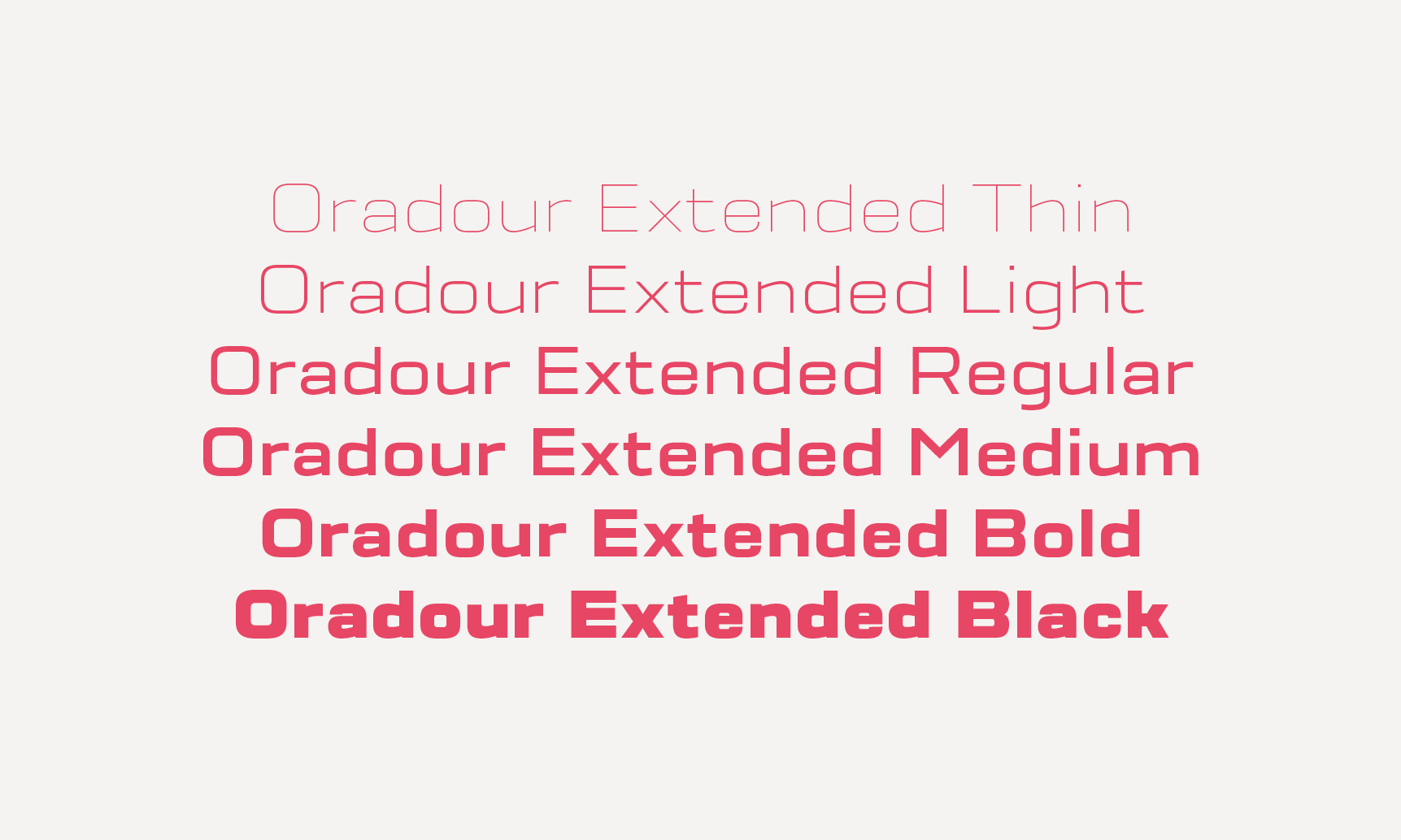
Oradour fills every possible space with its false geometry. It pushes the width on all sides, bends curves into corners and blows weights to implosion. Inspired by french vernacular lettering, it is also a contemporary re-interpretation of Eurostyle typeface (Aldo Novarese) by stripping it from this dated aesthetic. Oradour comprises three widths and six weights, going from Thin to Black. Decorative variants (Dot, Inline) are under development. Thanks to Malou Verlomme for monitoring the project. Available at Long-Type foundry. Go check on the genesis of the typeface.